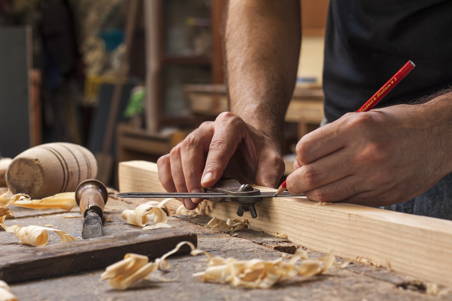
Website & Branding Design

With a portfolio of stunning custom-made doors, kitchen/bathroom remodels, and space-saving solutions, Z Carpentry's clients are eager to see Jakub's past work.
My goal was to create a website from scratch that showcases the beauty and craftsmanship of Z Carpentry's projects, while also strengthening client relationships and developing trust with potential new clients.
Research
Competitive Analysis
I analyzed the websites of Z Carpentry's competitors including NYCRenovations, OzInstallation, and Loti Contracting. I identified best practices and opportunities for differentiation. This research can provide insights into what works well and what can be improved.
Card Sorting
I conducted a card sorting exercise with users to help identify the optimal structure and organization of the website content. This can help ensure that users can easily find what they're looking for on the new website.
User Interviews
I conducted 8 unmoderated interviews with existing and potential clients. I identified their needs, preferences, and pain points. These insights can be used to inform the website design, content, and functionality.
Persona Developement
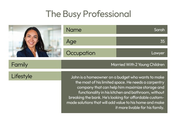
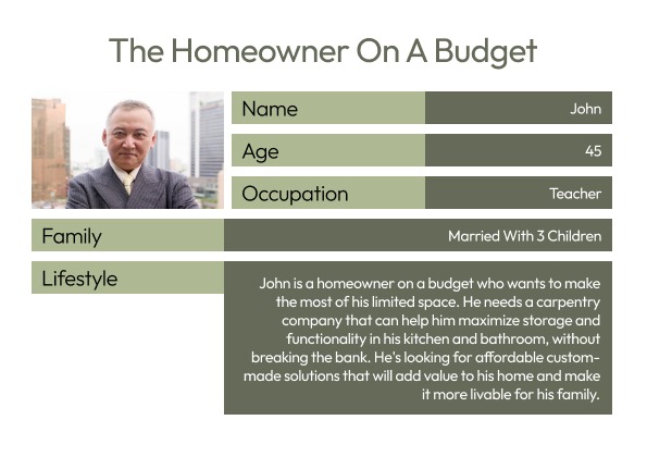
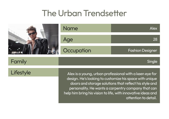
I developed user personas based on research and analysis that can help create a website that caters to the needs and preferences of Z Carpentry's target audience to ensure that the website resonates with users and meets their needs. Personas includes:
The Busy Professional
The Urban Trendsetter
The Homeowner on a Budget
Personas
Key Themes
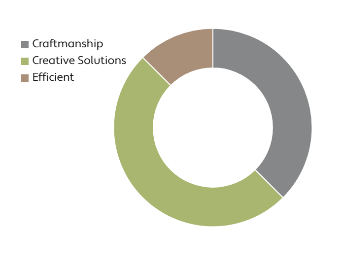
I gathered 93 data points and have identified the most important themes that existing customers care about for Z Carpentry. Key themes include quality craftsmanship, personalized service, attention to detail, and creative solutions for small spaces.
These themes are consistently mentioned by existing clients when describing their positive experiences with Z Carpentry, and we believe they should be emphasized on the new website. By highlighting these themes in the website's design, content, and functionality, we can ensure that the website resonates with existing customers and attracts new clients who value these same themes.
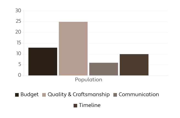
Based on our findings from user interviews, competitive analysis, and surveys, the most important themes for prospective customers include budget, quality and craftsmanship, communication and personalized service, timeline, and space optimization.
These themes were consistently mentioned by potential clients when discussing their decision-making process for choosing a carpentry company. By emphasizing these themes on the new website, we can attract and engage prospective customers and build trust in Z Carpentry's abilities to meet their needs and exceed their expectations.
Ideation
I considered the major themes from our research, including quality craftsmanship, creative solutions, personalized service, timeliness, and space optimization. To create a website that showcases Z Carpentry's expertise in these areas, I explored different creative solutions.
For example, I sketched different ways to showcase a project gallery that features high-quality images of Z Carpentry's work and highlights the company's design and craftsmanship skills.
Re-branding
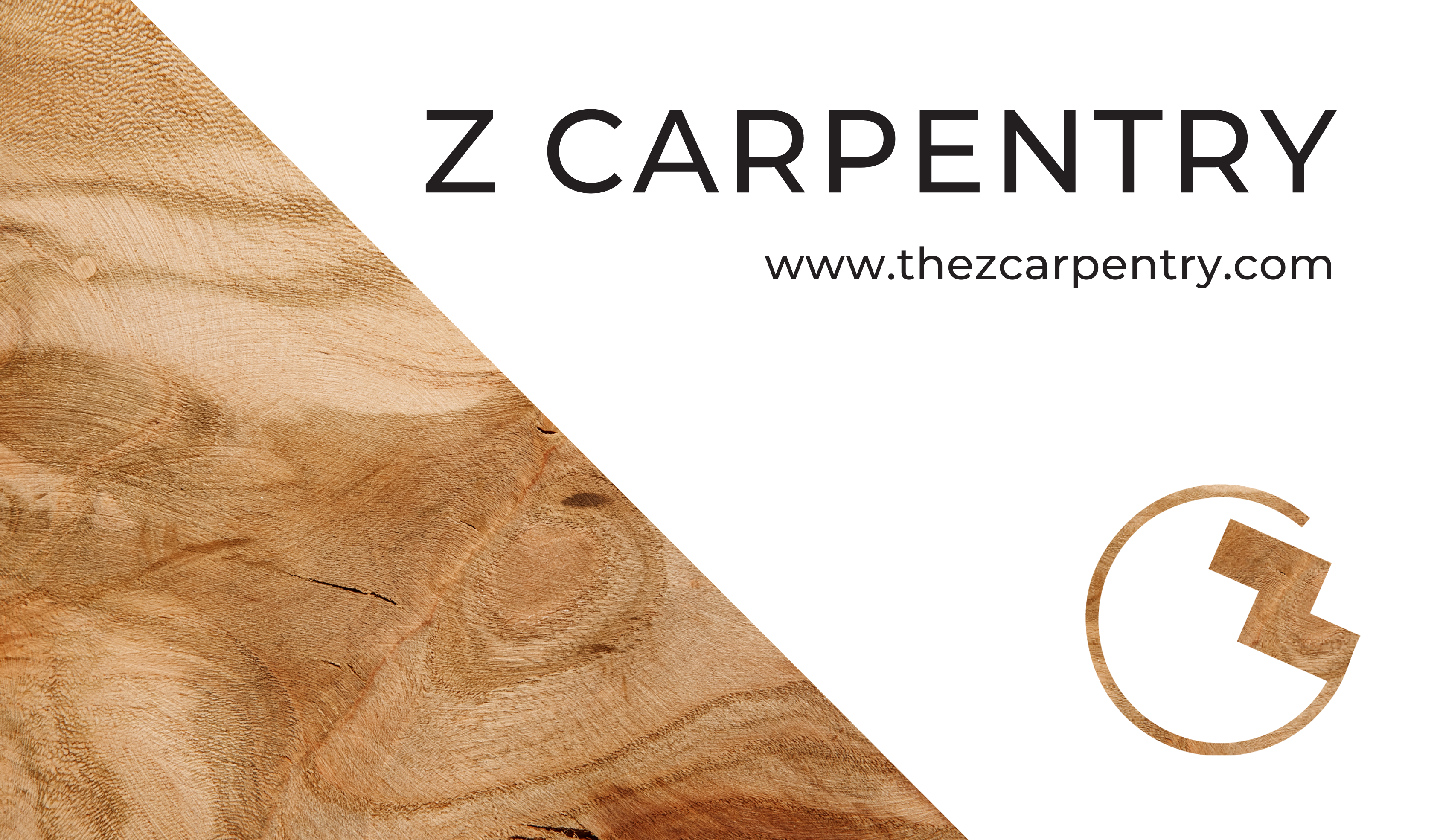
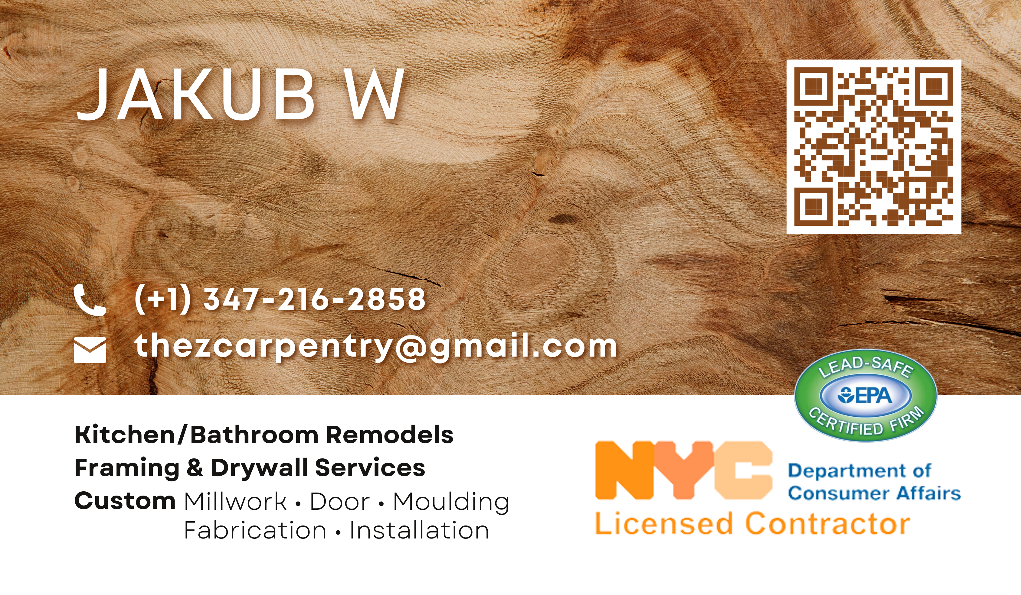
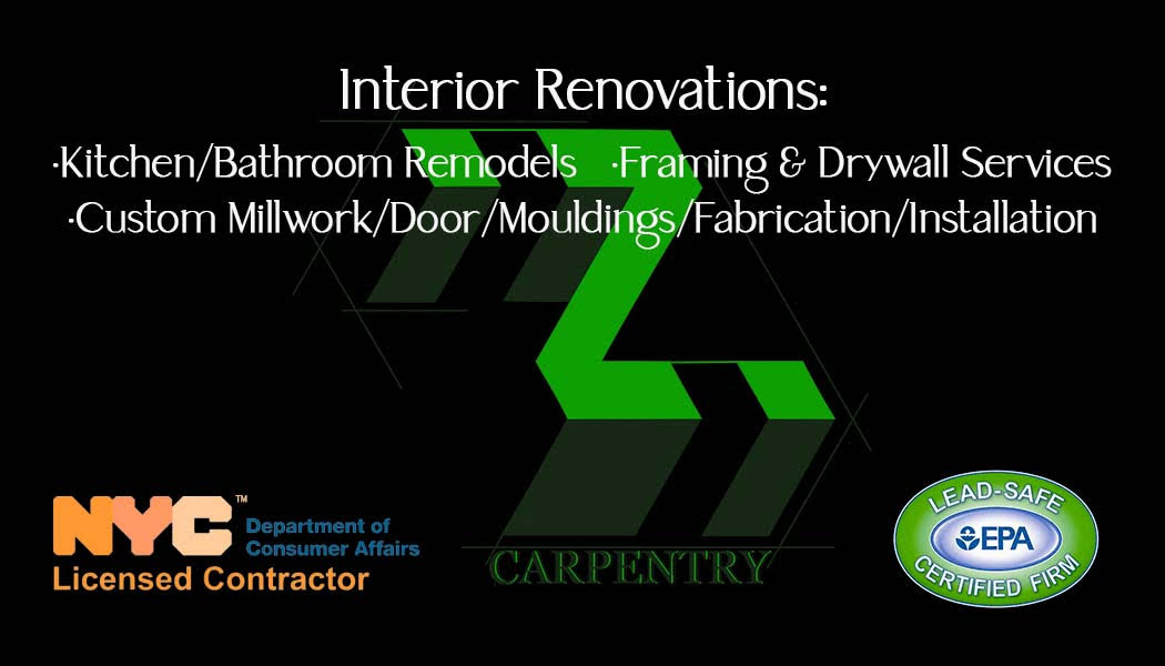
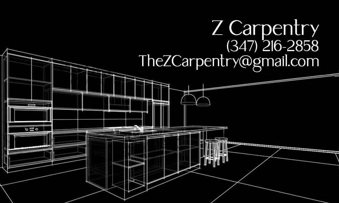
I wanted to re-brand Z Carpentry with a more warm, woody, homely feel because the original branding, with its black and green color scheme, felt too cold and distant. Carpentry is a craft that involves working with natural materials and creating functional and beautiful spaces, and I wanted the branding to reflect this. By incorporating warm and inviting colors, such as browns and earth tones, and using natural textures and materials, such as wood grain and stone, the new branding can better convey the company's commitment to quality craftsmanship and personalized service.
This re-branding will also help to build trust with clients, as it communicates that Z Carpentry is a company that prioritizes creating comfortable and welcoming living spaces that clients will love.
Re-Branded
Original
Wireframe & Prototype
After brainstorming a variety of creative solutions for the Z Carpentry website, I narrowed down the options based on feasibility, usability, user experience, and alignment with the company's brand and goals.
Once the solutions have been selected, I developed wireframes and prototypes to test the website's functionality and user experience and refine the design until the final site meets Z Carpentry's needs and expectations.
Usability Testing
Navigation
I tested how easy it is to find information on the website, such as project galleries, Z Carpentry’s story, and contact information. Ensure that the navigation is intuitive and straightforward.
Design
I interviewed users on how well the design supports the brand and overall user experience. Ensuring that the design is visually appealing, easy to read, and consistent throughout the website.
Speed
I tested how quickly the website loads, particularly on mobile devices. Ensure that the website is optimized for speed and that images and videos do not slow down the website.
Contact Form
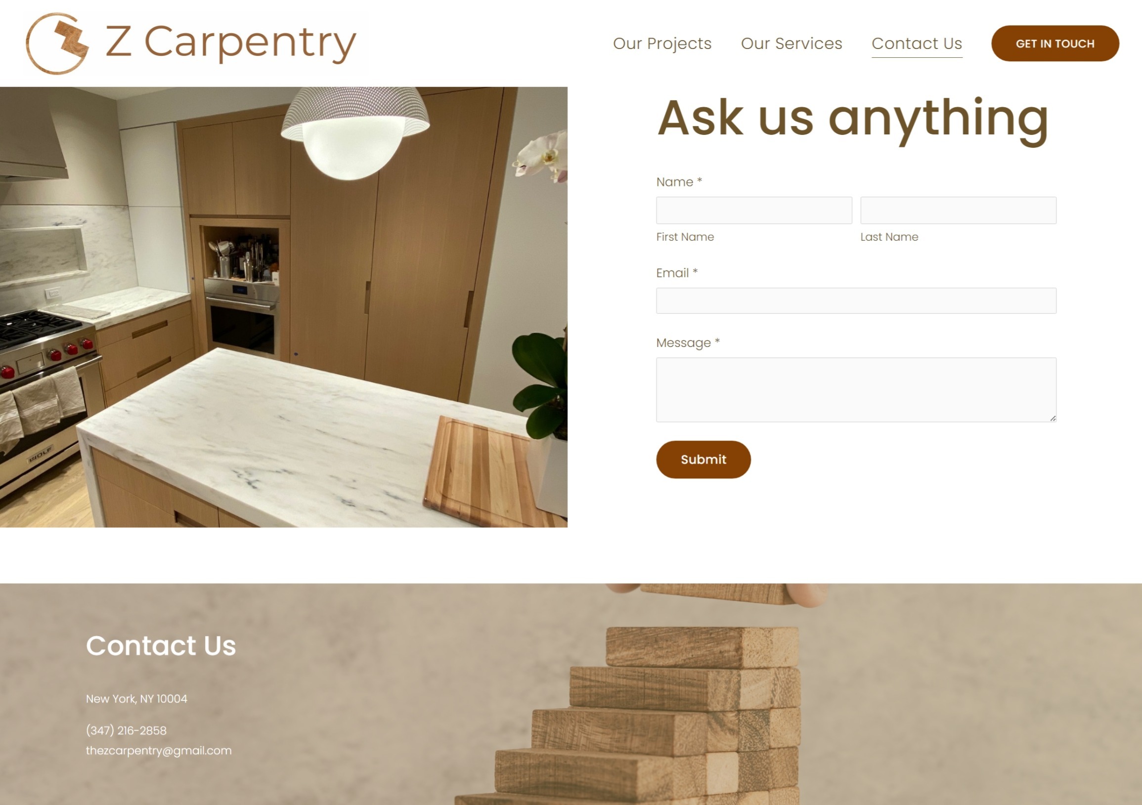
I tested how easy it is to use the contact form, including how easy it is to find it and fill it out. Ensure that the form is functional and that user information is captured accurately.
Content
I tested how well the content supports the user experience and the brand. Ensure that the content is informative, easy to read, and engaging.
CTA Buttons
I tested the effectiveness of the call-to-action buttons. Ensure that the CTA buttons are clear, prominent, and easy to use and ultimately translate to conversion.
Iteration
After testing the Z Carpentry website for usability, I gathered data on what was working well and what needed improvement. I then used this data to iterate the designs.
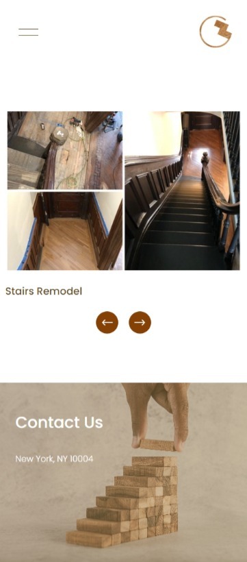
One area that required attention was mobile navigation, which was found to be confusing for some users. I simplified the navigation to make it more intuitive and easier to use. Additionally, I found that the call-to-action (CTA) buttons were overwhelming for some users, so we simplified the design and reduced the number of CTAs on the website, which saved space and made the website less cluttered.
These changes resulted in a more user-friendly and visually appealing website that better aligned with Z Carpentry's brand and goals.
Launched version
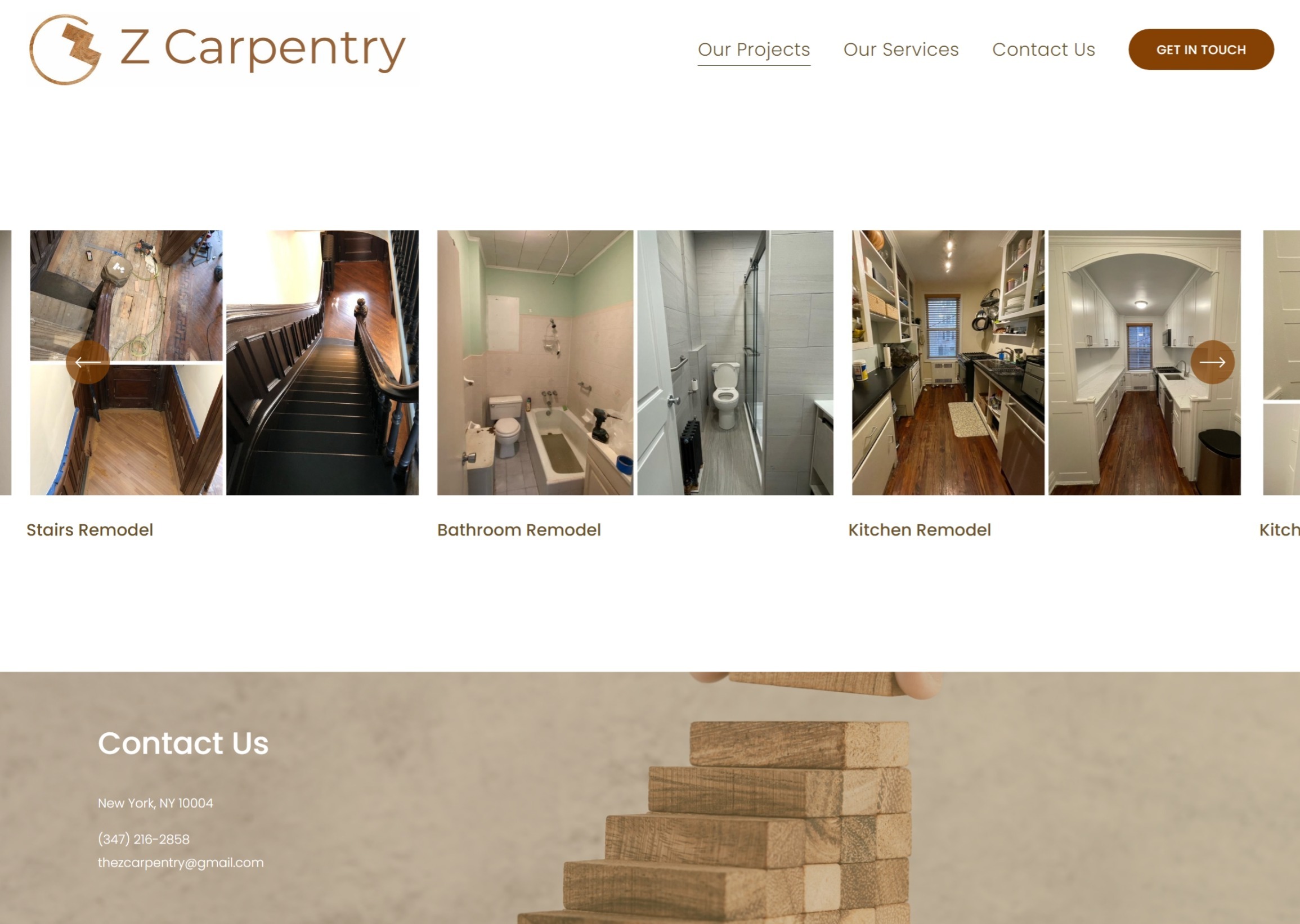
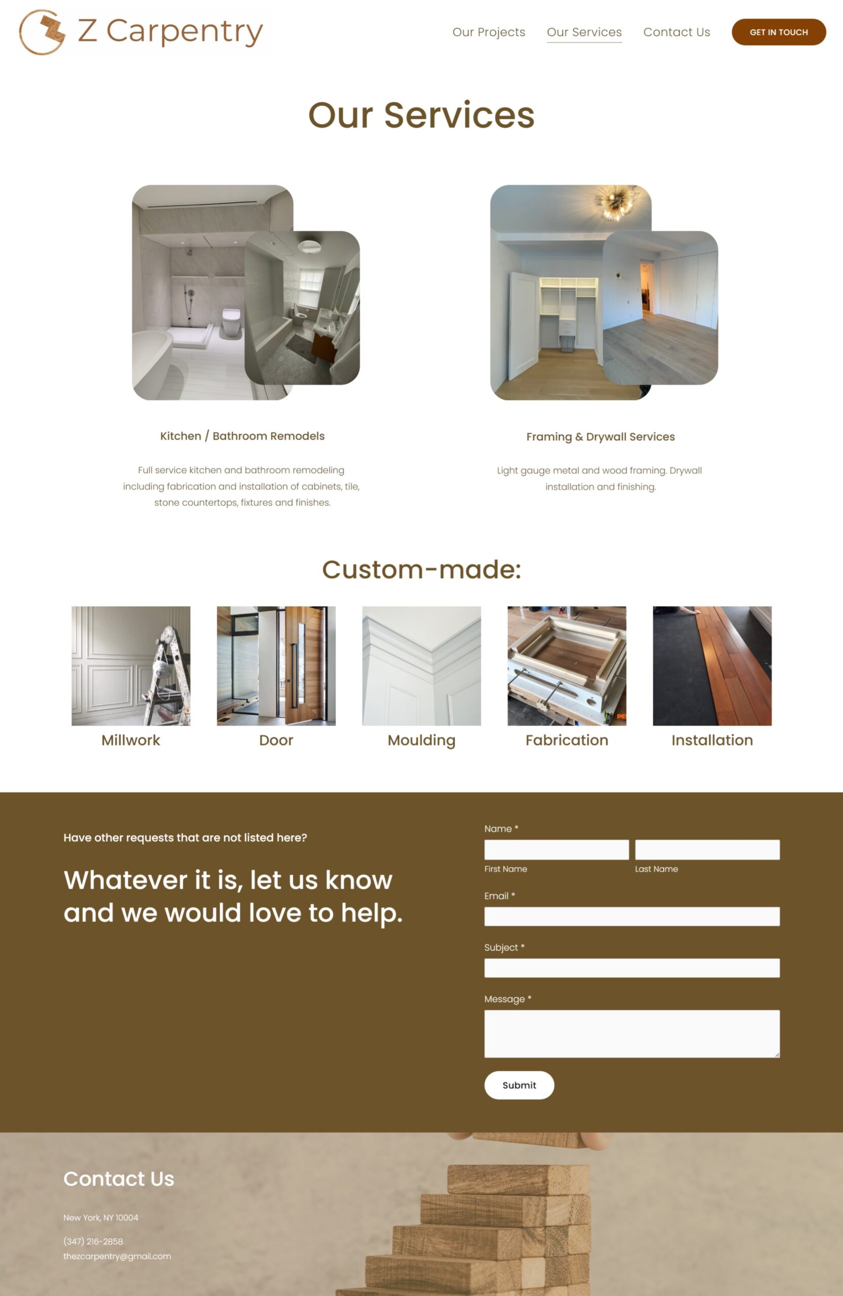
The first version of Z Carpentry's website has been launched, and I look forward to discovering more insights through ongoing analytics to continue refining the user experience and achieving the company's objectives.


Other Pages



Interested in working together? Get in touch!
Perspective
